 Reinforce Labs
If you're building or evaluating vision-language models on chart and plot understanding, you've probably noticed something uncomfortable: scores on public chart-QA benchmarks keep climbing, but models still botch real charts in the wild. Stacked bars with tiny segments. Dual-axis line plots. Truncated y-axes. Log scales that look linear. Your benchmark says you're winning. Your users say otherwise.
This post is for researchers and product managers who don't have the budget to commission a new hand-labeled benchmark every quarter, but who need evaluation data that actually catches what's broken. Here's a four-stage pipeline for generating synthetic chart VQA data, targeted at the failure modes your model actually has, with verified answers, calibrated difficulty, and no human labelers in the critical path.
The gap data scaling can't reach
Frontier VLMs do well on aggregate chart-QA leaderboards and badly on a small, well-defined set of conditional pathologies: stacked-bar segments under one percent of plot area, dual-axis lines with near-identical palettes, smoothed series crossings between tick marks, pictogram counting, dense annotations. These failures are conditional on specific geometric or typographic properties that no broad training corpus systematically over-samples. Layer on the fact that most chart-QA datasets are dominated by single-value lookups, and you have a headroom problem that more scraping won't solve.
Three existing approaches each leave a structural gap.
- Web scraping with caption pairs (ChartQA, Chart-to-Text) gives volume but visual homogeneity, mostly stock financial charts, with weak caption-to-pixel alignment.
- Template-generated QA (FigureQA, DVQA) is deterministic and scalable, but models memorize the templated surface form and crater on human-written variants.
- Single-pass code-grounded synthesis (ChartLlama, ChartX) fixes answer verifiability but doesn't concentrate samples where frontier models actually fail, and usually operates at a single fixed reasoning depth.
A four-stage pipeline to generate high quality eval data
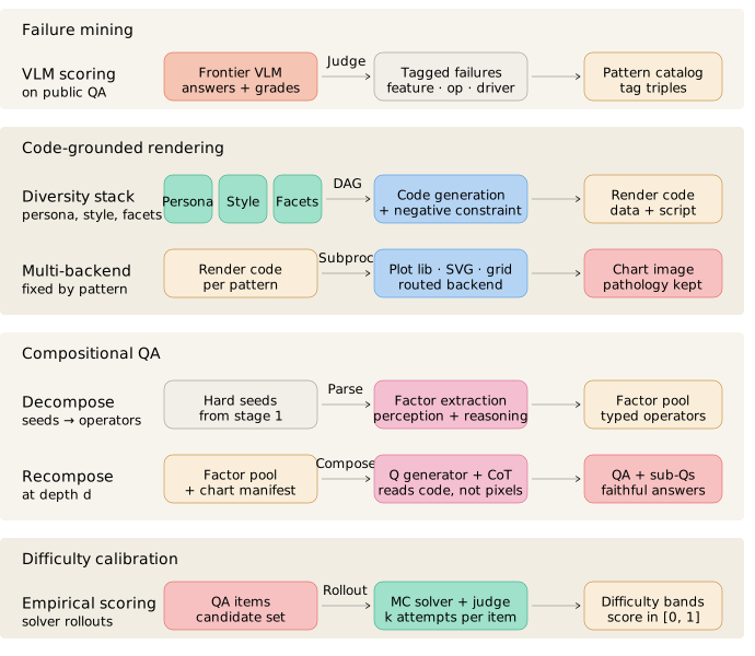
Stage 1 — Discovery: mine real failure patterns
Run a frontier VLM on a public benchmark, audit every error with a vision-capable judge, and tag failures across four dimensions: failure modality, visual chart features, reasoning operation, and difficulty drivers. Cluster the co-occurrences. What pops out are recurring (feature, operation, driver) triples, pathologies your model actually has, not pathologies you imagined. Each becomes a generation recipe.
Stage 2 — Rendering: code-grounded chart synthesis
Generate charts in a decoupled subprocess across multiple plotting backends. Multi-backend output beats single-library generation on both downstream accuracy and pairwise image diversity. The critical line in every recipe is a negative constraint: forbid compensatory data labels, gridlines, and callouts. Without it, over-helpful code-gen LLMs will erase the pathology and collapse visual reasoning into OCR. Stack diversity layers on top of personas, style archetypes (broadsheet, magazine, scientific, technical brief), and per-sample LLM-expanded facets. Keep the rendering code, structured data, and seed QA in a manifest; the QA layer reads them, not the pixels.
Stage 3 — Compositional QA: decompose, then recompose at depth
Use a multimodal LLM to break hard seed questions into perception primitives (read this value, locate this label) and reasoning operators (comparison, calculation, projection, extrapolation, fact-checking). With k perception primitives and m reasoning operators at depth d, the state space scales as k · md, multi-hop questions that don't exist in any scraped corpus. Generate the chain-of-thought separately, from the validated subquestion chain only, without the image. This prevents the CoT step from inventing new facts.
Stage 4 — Difficulty calibration: gate every sample
For each (image, question, gold answer) triplet, run N rollouts at high temperature against a solver matched to your target model's capability tier. Use a vision-capable judge for semantic equivalence (with numeric tolerance and set-equality). Difficulty equals the fraction of incorrect rollouts:
Two principles matter here. First, calibrate against your actual target, using a much stronger reference model makes hard samples look easy, and you'll skip the supervision zone where you need it most. Second, multi-rollout sampling is non-negotiable; greedy decoding is a binary indicator that masks the probabilistic regime where most of the fine-tuning leverage lives.
Strong models still fail on synthetic Chart VQA
To sanity-check that calibrated samples actually discriminate, we spot-checked eleven items from the first MM-Chart-QA partition against three frontier VLMs. Each model answered every question three times; a vision-capable judge scored semantic equivalence against the gold answer. The point isn't a leaderboard headline, it's whether the set still has headroom after you've already filtered for difficulty.
| Model | Perfect | Consistent | Any correct | Never |
|---|---|---|---|---|
| Claude Opus 4.7 | 2 | 3 | 3 | 3 |
| Gemini 3.1 Pro Preview | 3 | 1 | 0 | 7 |
| GPT-5.5 | 1 | 1 | 2 | 7 |
Each cell is a sample count (out of eleven), bucketed by how many of the three rollouts matched the gold answer: Perfect (3/3), Consistent (2/3), Any correct (1/3), and Never (0/3).
Example: HLS-02
One sample from the spot-check set shows why a single pass rate hides the story. HLS-02 is a multi-hop question over a synthetic choropleth dashboard (county death rates, Q5 bin bounds, and a national trend panel). It requires reading values off a bar chart, ranking counties, and projecting a trend against a labeled floor, not a single lookup.
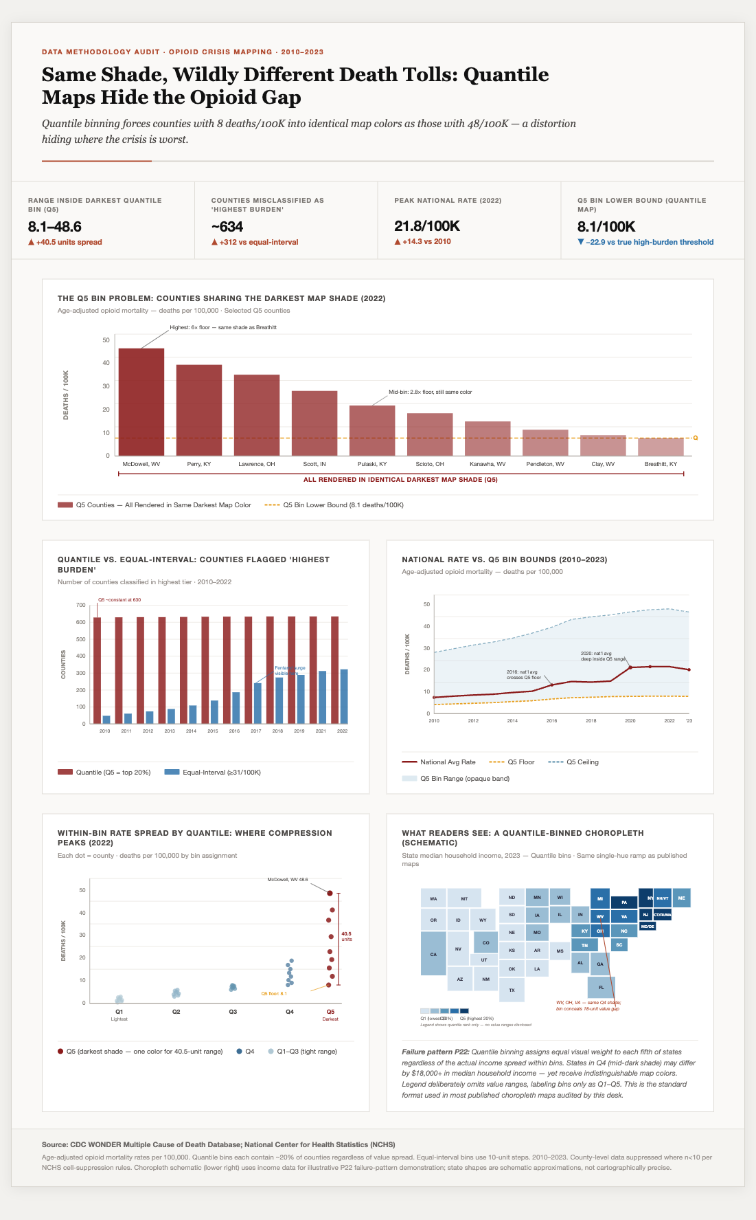
Question: What is the spread between McDowell, WV's death rate and the Q5 Bin Lower Bound of 8.1 per 100K, who is the 5th highest Q5 county, and will the national average rate stay within or exceed the Q5 Floor by 2025?
Gold answer: 40.5; Pulaski, KY; within
| Model | Pass rate | Outcome |
|---|---|---|
| Claude Opus 4.7 | 1/3 | One rollout nails all three sub-answers; the other two mix correct reads with a different framing on the trend question. |
| Gemini 3.1 Pro Preview | 0/3 | All three rollouts answer Unanswerable. |
| GPT-5.5 | 0/3 | Two Unanswerable; one partial read (40.5 and Pulaski KY) but rejects the 2025 projection as not shown in the chart (data ends 2023). |
The gold answer is fully grounded in the chart and annotations. Frontier models still split on whether the third sub-question is fair game, a multi-hop compositional QA item doing exactly what Stage 3 is for.
Why your team should care
Benchmark data has become the bottleneck for model evaluation, and waiting for the community to ship the next labeled dataset isn't a strategy. If you're a researcher, this gives you evaluation data targeted at your model's actual weaknesses, verifiably correct, difficulty-calibrated, and rich in multi-hop reasoning chains. If you're a PM, it means you can ship eval coverage for new chart types or failure modes in days, not the months it takes to scope, contract, and QC a human-labeled set.
An initial partition of the corpus is now live at huggingface.co/datasets/reinforcelabs/MM-Chart-QA. Reach out at contact@reinforcelabs.ai for the full manifest.